


barbican-reset
11398
2.21.0
I’m a web designer and developer whose learning to write more interesting stories and less complex code. I work for the Barbican, an arts centre in London.
In February 2020, we redesigned the account dashboard for users of the Barbican ticketing site.
Why? The existing design was functional, but not great for browsing on mobile and didn’t reflect the brand very strongly.
How? Combine Vue.js with the Spektrix ticketing API and do a re-design in Figma.
We knew this online space would evolve. We expected the number of services provided (and the way we provide them) to change fairly often, so it was important the design could handle iteration gracefully.
Our Digital Products team is small at the Barbican so we have to be agile when we build. The hardest part of this project would be in transitioning our ticketing experience from an iframe-based interaction to a feature-rich API-driven one.
Doing this meant we could improve fundamentals such as:
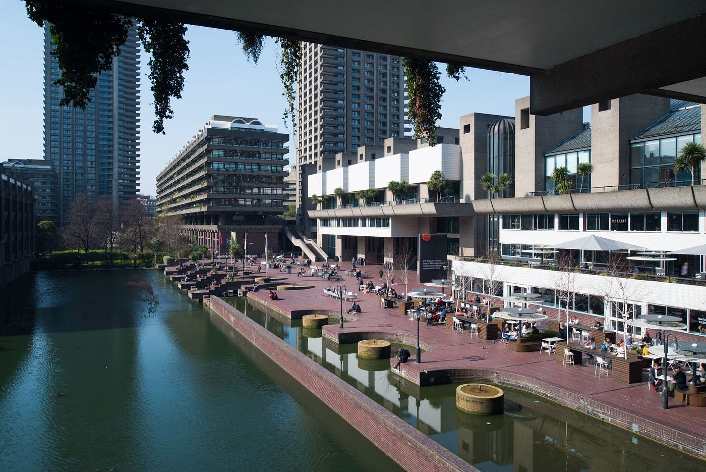
A view of the Barbican Centre from the lakeside. It is Europe’s largest art centre and home to a concert hall, 2 art galleries, 2 theatres, 3 cinemas, a rooftop conservatory and a residential estate.
Removing assumptions is an important part of the design process, so we used various exercises to include a wide range of contributions.
We began with a card sorting exercise, asking several people to sort functionality into groups based on their assumptions. This helped create more intuitive account navigation.
Next, we ran crazy eights. For this exercise, each group member was asked to sketch eight ideas in eight minutes. This is usually done by folding a sheet of paper into eight pieces and scribbling an idea into each one.
This process is designed to quickly generate simple ideas, which can then be iterated upon during the prototype stage.
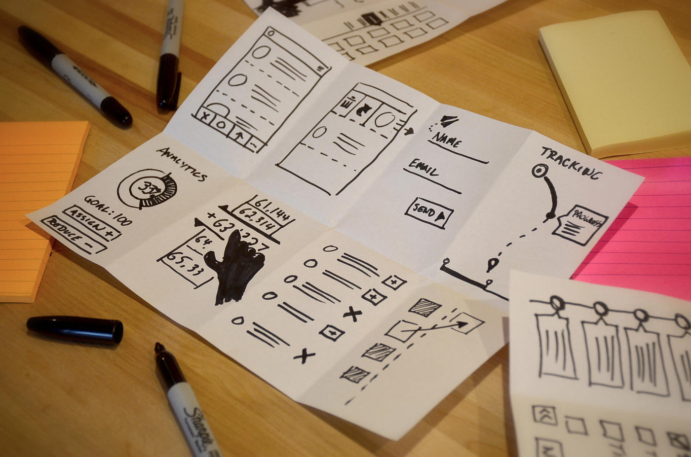
Ideas for Crazy Eights are typically sketched on a single sheet of A4 paper.
Prototypes are designed & shared online using Figma.
At this point, we can create working layouts, which are informed by our group research, and can also be shared with our user panel for further testing.
These prototypes don’t always look immediately similar to the final product. Sometimes more complex designs are refined during multiple rounds of testing.
In this case, the final design was inspired by the Tate Shop.
I love how you can navigate this layout without extra menus. The browsing experience is very similar on all screen sizes. You don’t need to re-learn how to browse on smaller screens (or vice versa) as there is very little content shift. I found this to be very elegant.
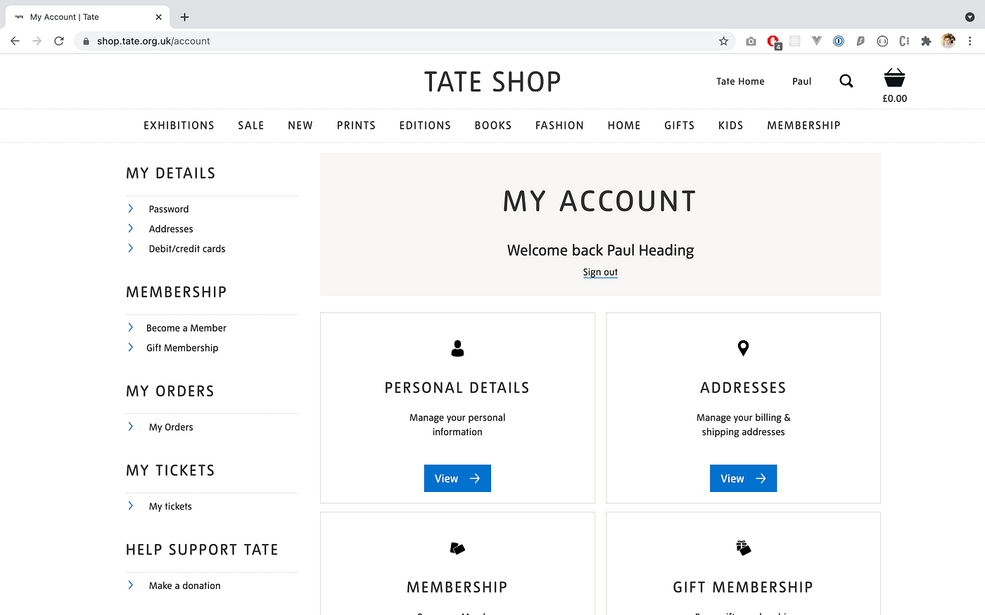
The account area for the Tate Shop inspired much of our design work. The modular layout became a flexible foundation for our build.
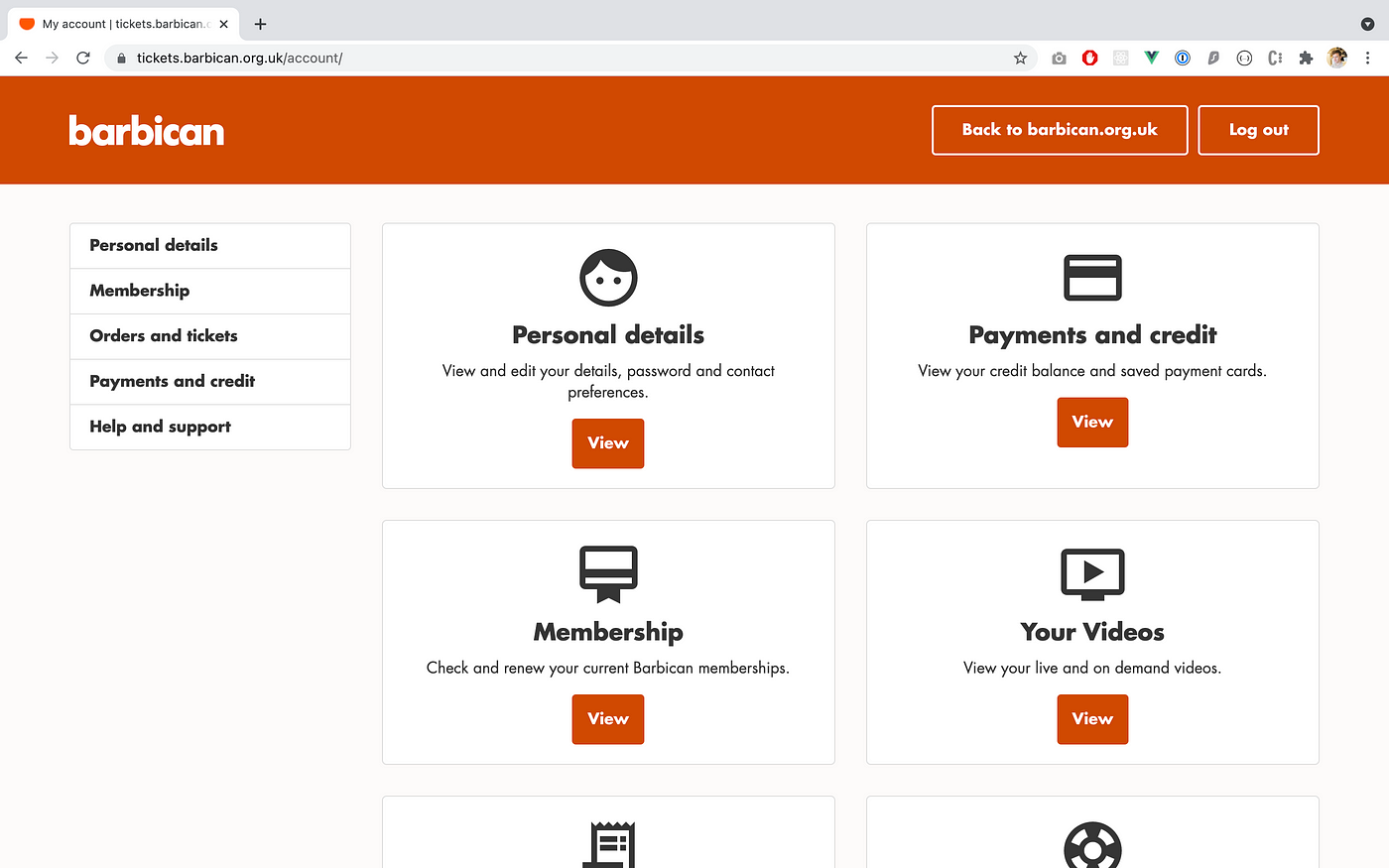
Everything built on our ticketing site is based on the popular front-end toolkit Bootstrap. This enables us to build consistently and predictably, speeding up development and improving user experience.
We also use the Material Icons resource. It’s a large, beautiful library of icons, that adds to this consistency.
This article is still being written. If you want to stay updated or have some suggestions, then please email hello@paulh.biz
Thanks for your message
I'll be in touch soon :)